Ink Review: Taccia Hokusai Sabimidori
Taccia Hokusai Sabimidori is an incredibly expressive teal ink. “Sabi midori” translates to “rust green”, which accurately describes the mix of the ink’s sheen and underlying shade.
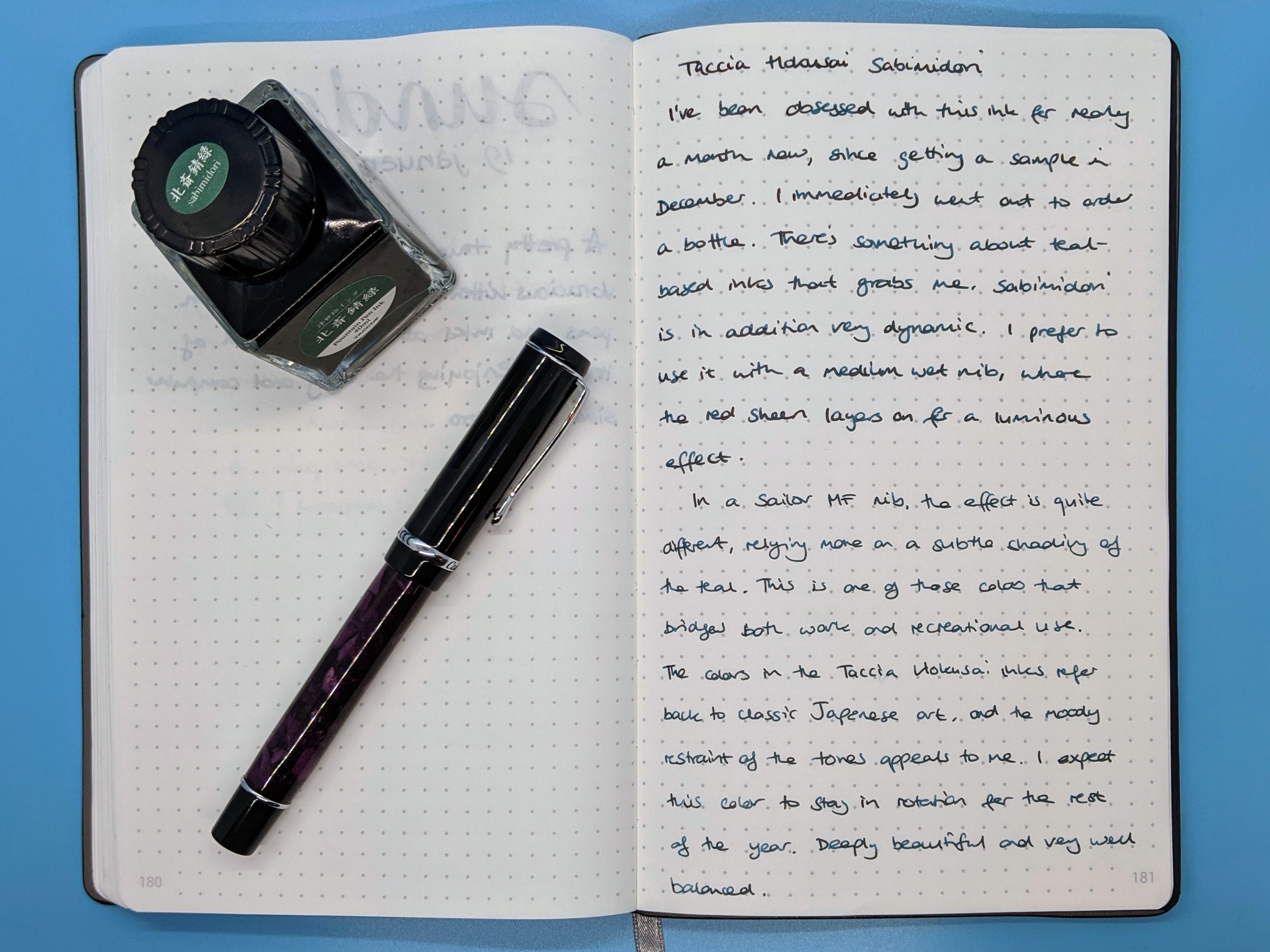
I’ve been obsessed with this ink for nearly a month now, since getting a sample in December, and immediately deciding I wanted to order a bottle!
There’s something about teal-based inks that grabs me. Different enough to be interesting, but “normal” enough for everyday use in many settings. Sabimidori is very dynamic, changing color depending on the paper and pen used. I prefer to use it with a medium wet nib, where the red sheen layers on for luminous effect.
With a finer nib, such as the Sailor MF, Sabimidori can look quite different, relying more on the subtle shading of the teal. It appears quite gray-green in an Kokuyo Idea notebook, nearly like the patina on corroding metal. You can see from the testing images below how wide a range this ink has!
Sabimidori is one of those colors that bridges both work and recreational use. The tones in the Taccia Hokusai inks refer back to classic Japanese art, beautifully used in the ink’s packaging: their moody restraint is very atmospheric.
I expect Sabimidori to stay in rotation for the rest of the year, easily! It has depth, beauty, and is very well balanced between the sheen and shade.
Keep scrolling for pictures. You can enlarge any image by selecting it.
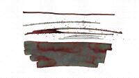
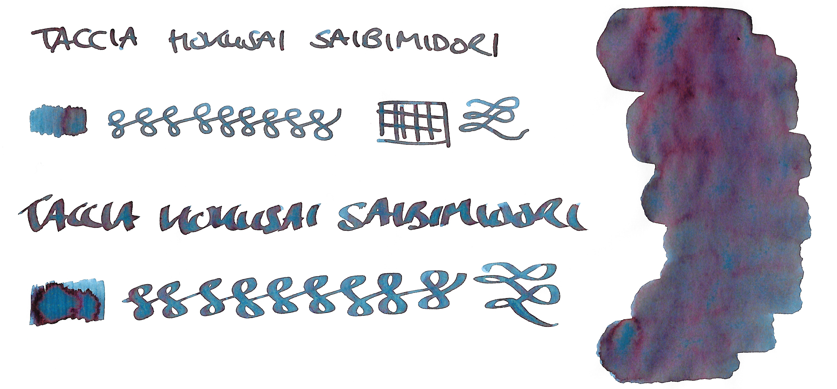
Writing sample on 68gsm Tomoe River paper. Conklin Duragraph medium nib, Sailor medium-fine nib.
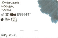
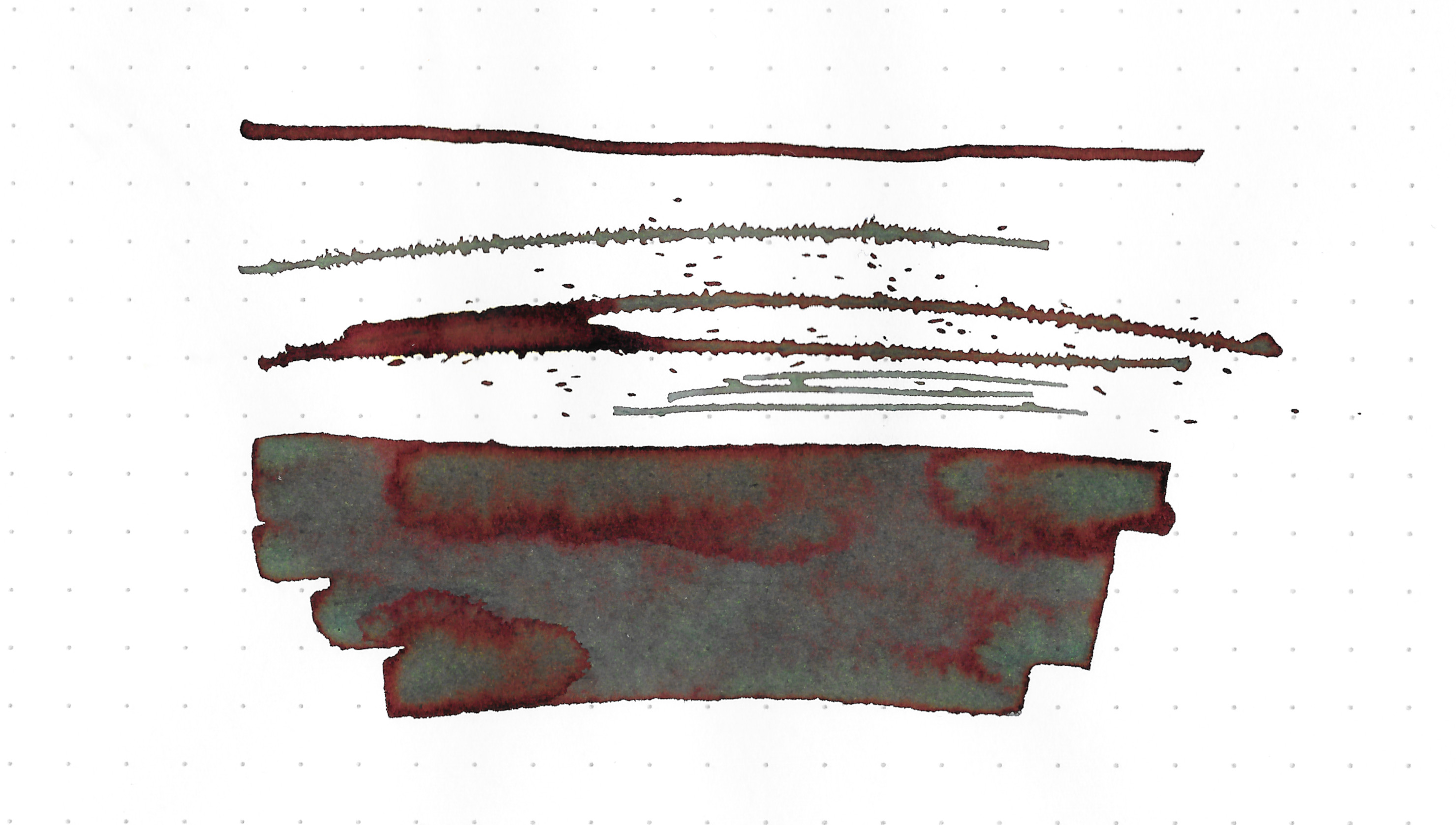
Swatch on 52gsm Tomoe River paper. Medium steel nib, and calligraphy nib.
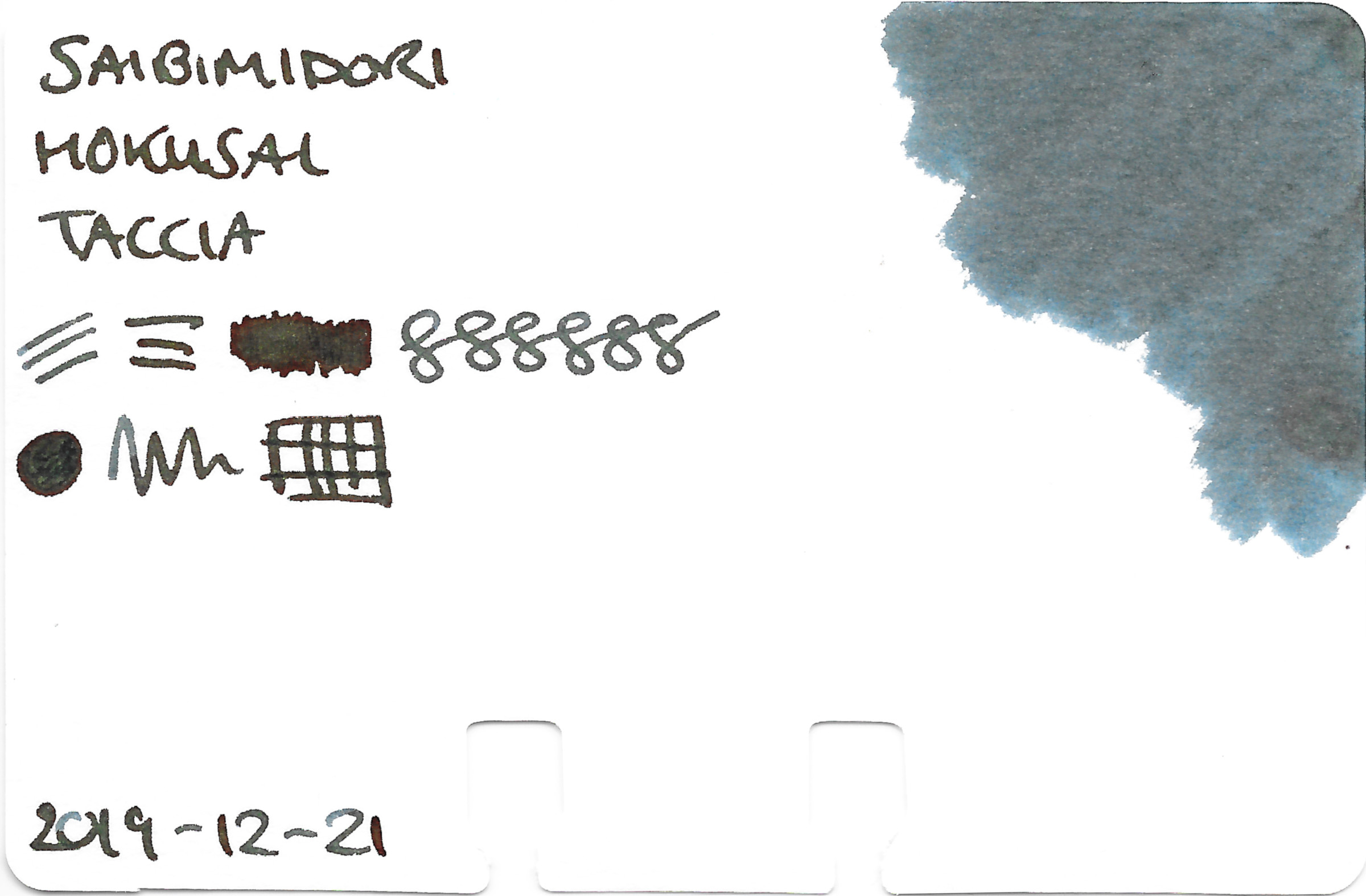
Ink sampling on Rhodia Dotpad. Check out the sheen!
Swatch on Col-o-dex card.
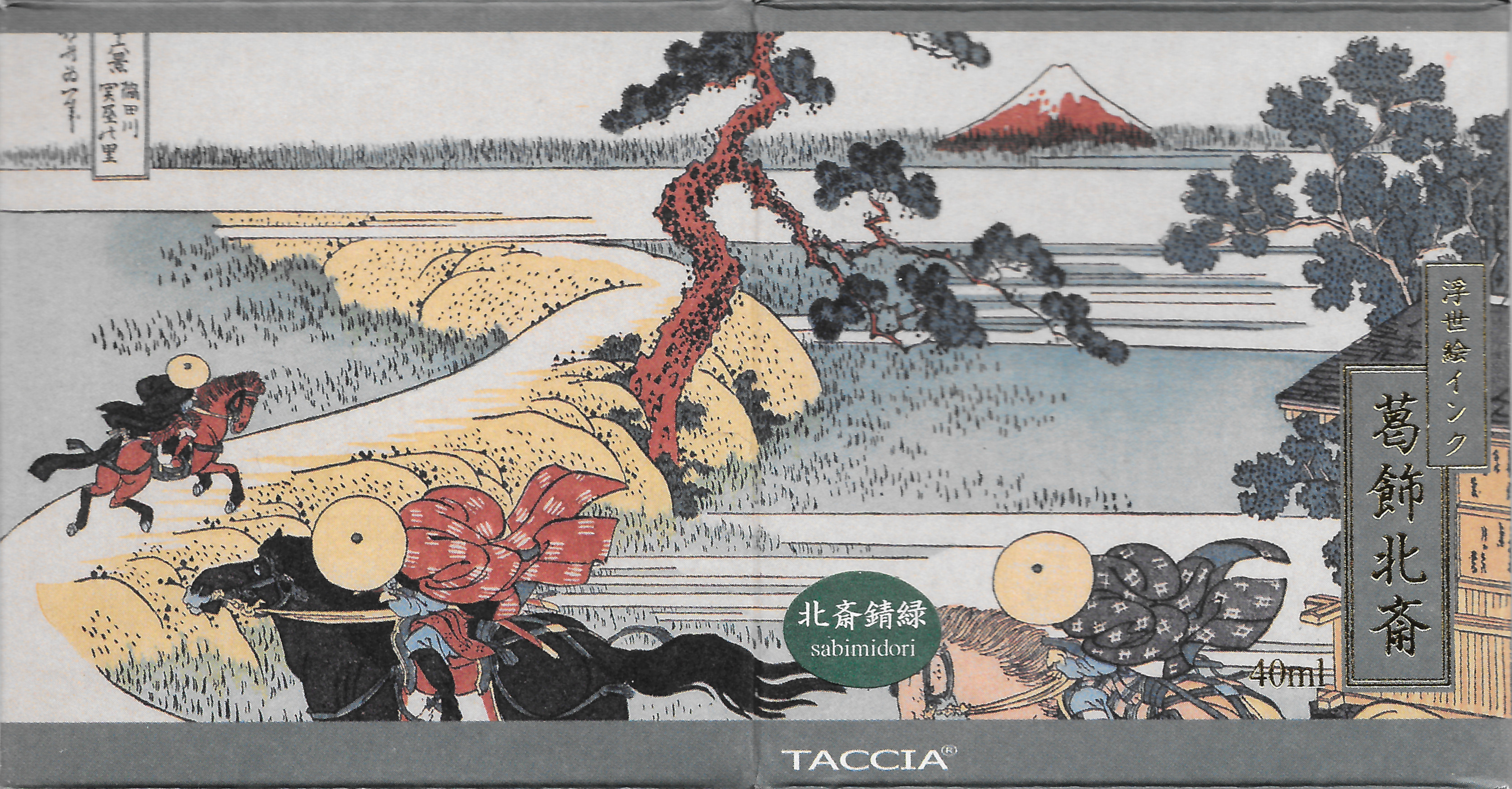
Beautiful packaging.
One final note: you’ll see the name of this ink misspelt in my swatches, as well as on the Pen Chalet site and other places. I kept the error in my swatches, but for the record the correct spelling is “sabimidori”.
For an in-depth look at this ink and others in the same series, check out Well Appointed Desk: Taccia Ukiyo-e Inks.
(Disclaimer: I purchased this ink myself, from Pen Chalet.)